Overview
Lendmart is a US personal loan provider with priority to offer fast and smart solutions to customers with the best possible lending experience.
An effective interaction between the lender and his client is crucial in the time period after receiving the loan.
What is happening at this stage affects the company’s most important priorities: the payout ratio and the predictability of the financial behavior of customers to reduce risks. The load of the customer service department and, consequently, the throughput of the business also depends on this.
A solution for the above is to provide clients with all relevant information and ability to easily perform all necessary actions.
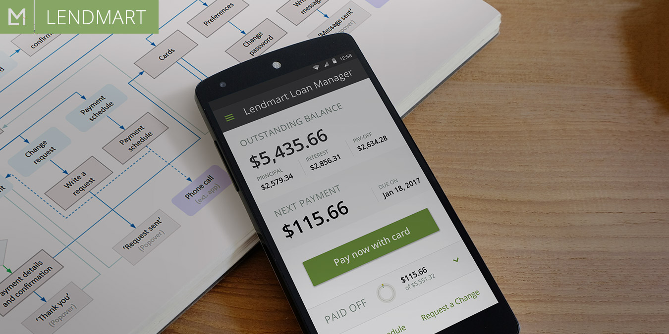
Challenge
We were challenged to create a place/tool (web or/and mobile) for increasing customer satisfaction, stimulation and facilitation of the payment process, improve the payout ratio and reduce the load on the customer service department.
My Role
Answering “What? Why? How?” questions: initial user research, problem and solution exploration, defining the app’s functionality, elaboration of user flows and interfaces.
Collaborators
Lendmart Customer Service and Compliance departments; business development manager and CTO; developers – technical implementation.
Audience
The target users represent an unspecific segment of US citizens who have turned to Lendmart for solving their financial problems and were accepted as borrowers. They represent a wide range of age and diverse occupations, most of them have low or average income.
Many of them, because of occupation, education or age, experience difficulties interacting with the computer and related technologies.
Constraints
Business goals and requirementsб as well as technologies used, impose constraints to the functions and capabilities of the app. In particular, a point where users’ and business’ goals meet is the ease of payments. However, not all the payment options were available according to regulations and other business reasons, which forced us to select an optimal solution from the limited list.
Design Process

1. Solution Exploration
In order to ensure that our solution satisfied both customer and business needs, we’ve conducted our initial research in both directions. On the one hand, we interviewed CSRs and, with their help, clients of the company, while on the other hand, we discussed the pressing issues and business goals with business development and customer service managers. This made it possible to compile a summary table of the problems and opportunities of clients and the company.
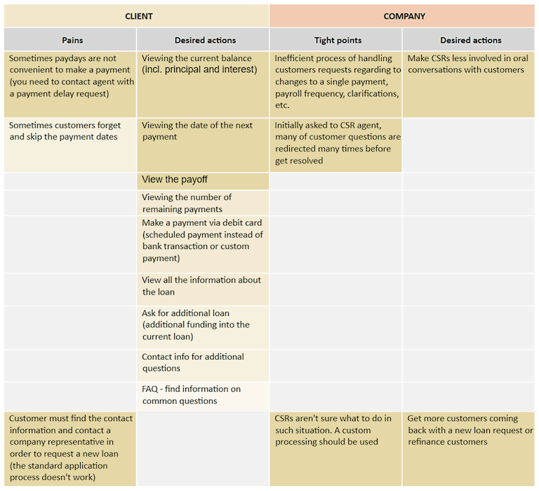
Based on the collected information, we developed the list of features which were assumed to serve as the solution and help both sides.
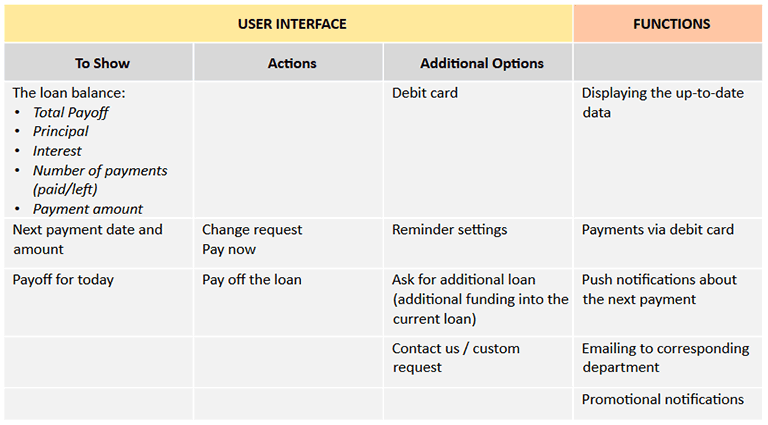
We had to define which format the solution should take. The analysis of the current workflows and statistical data was a key source for such decision.
Since mobile traffic had a larger share (about 60% of the total traffic), and also considering the possibility of creating a smoother user experience on mobile devices, it was decided to take a mobile app as the main format of the solution. A web page with limited functionality was projected to serve validation purposes and also as an MVP.
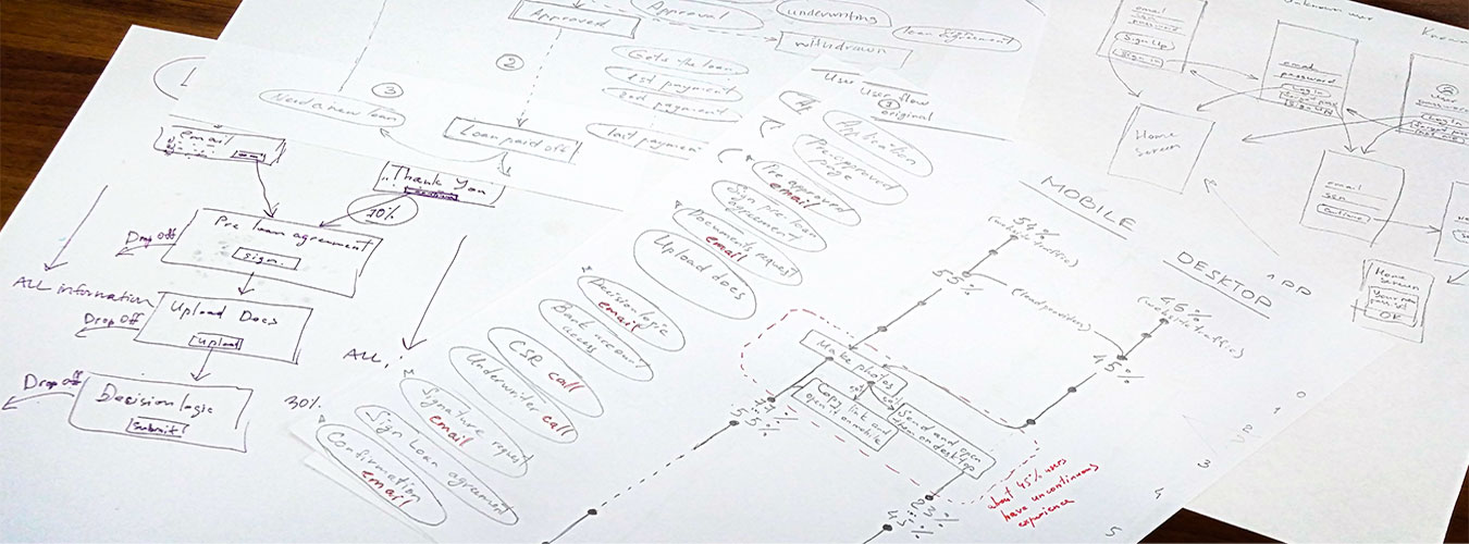
With respect to mobile platforms, there was no significant dominance of any of them, with an easy superiority of Android. This fact, as well as technical constraints, turned our choice to a cross-platform technology.
2. Prototyping and Validation
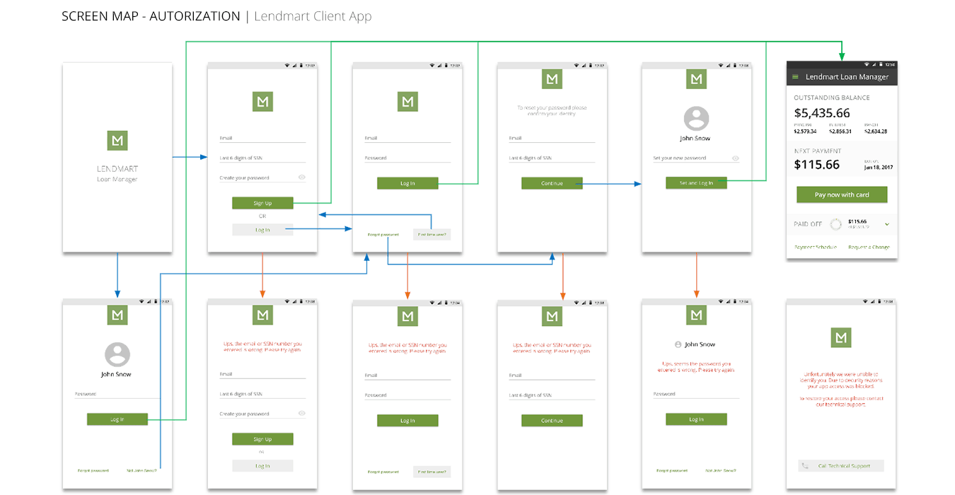
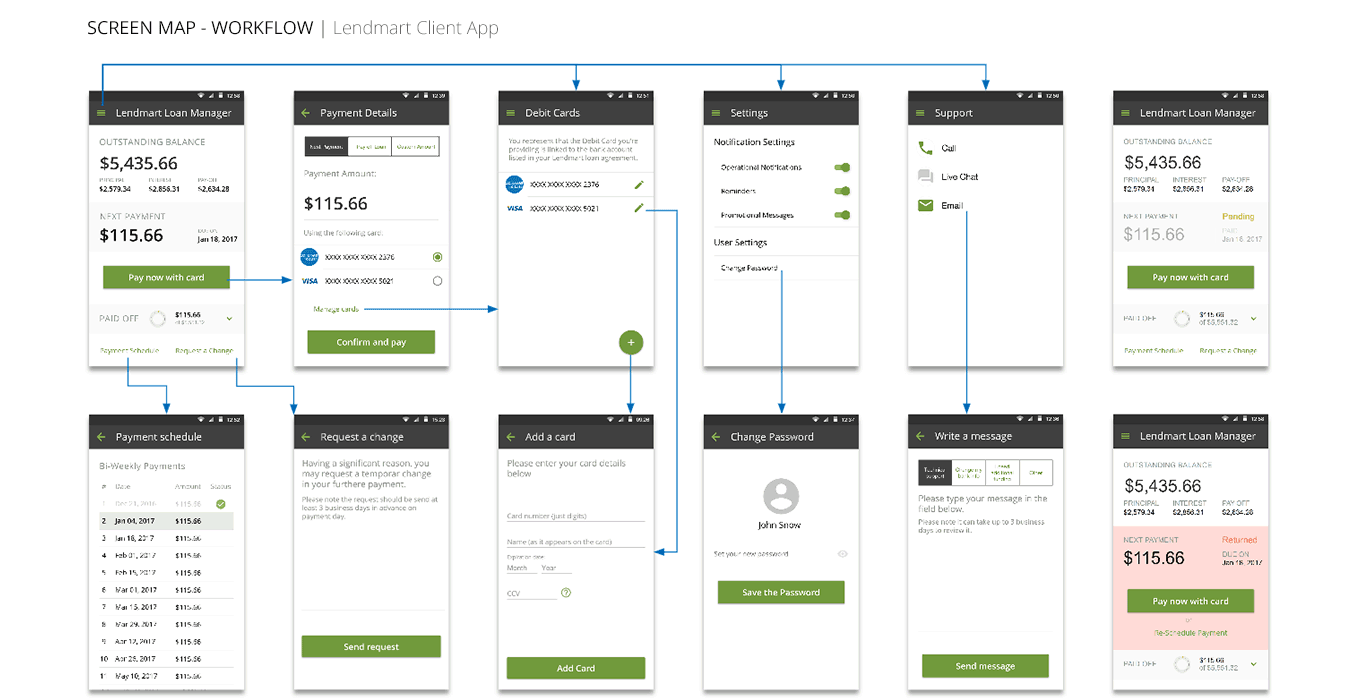
Based on initial user research we determined the most important use cases and used them to develop an efficient user flow that would meet users’ needs:
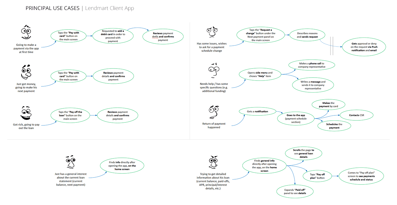
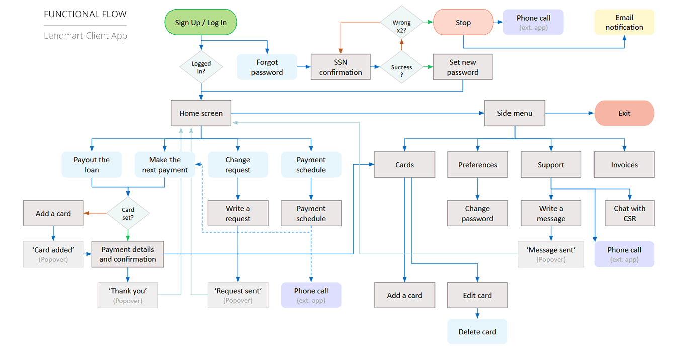
Despite user never leaving the central point of the design, business goals and requirements were our crucial criteria and constraints throughout the project. Thus, I designed the UI around user needs but also considering business needs and priorities.
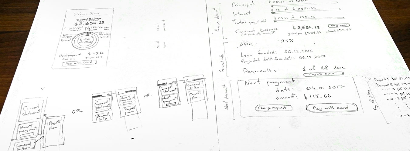
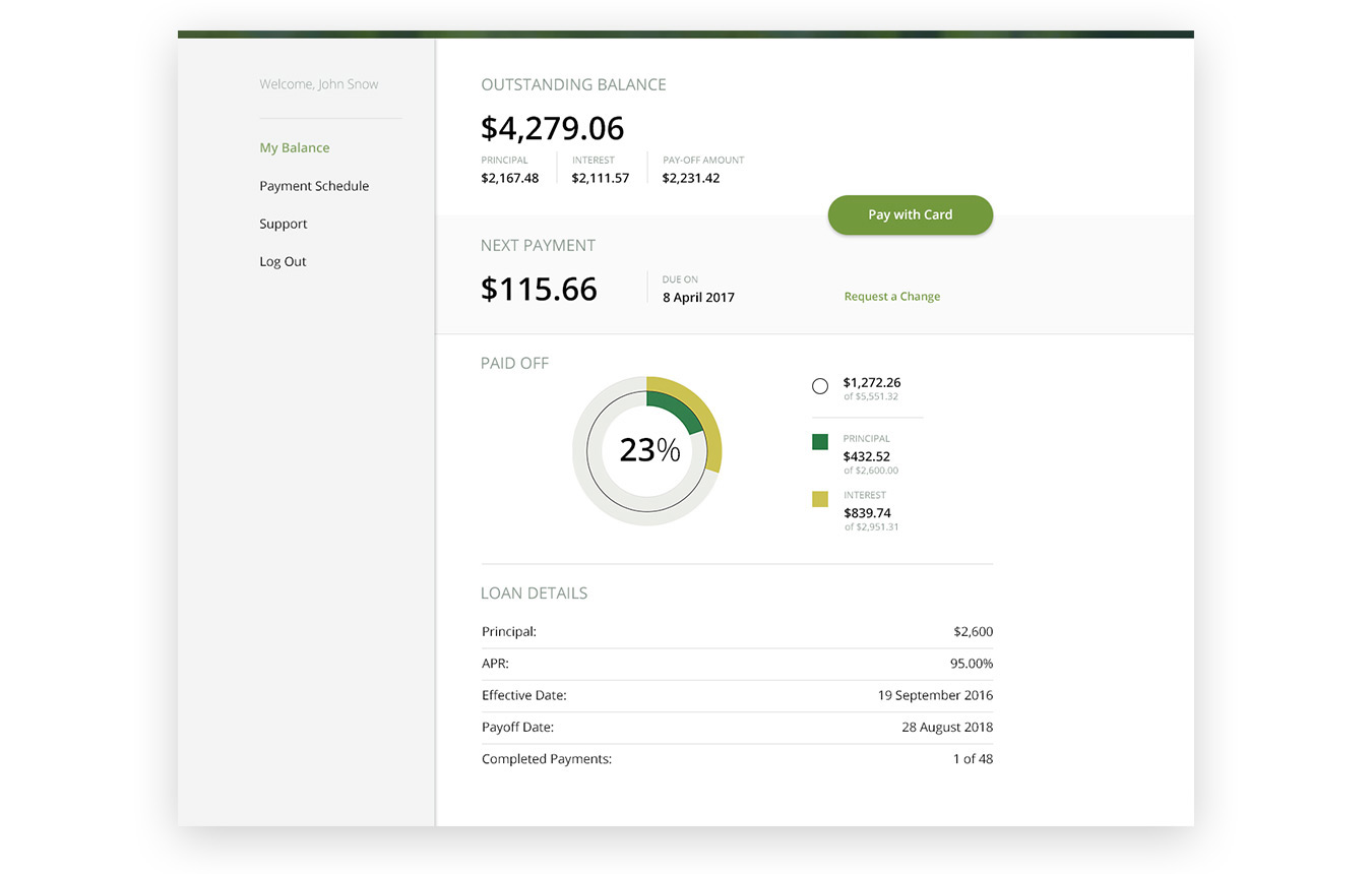
Once the flow and main UI principles were designed, I was able to design the web page for use as an MVP for validation.
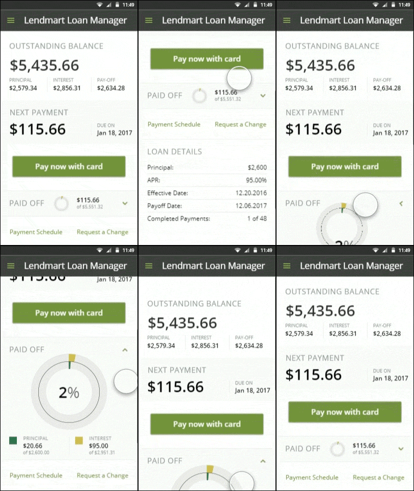
To validate the mobile app concept, I built a functional interactive prototype using Proto.io app.
Outcome
The creation of a client app for a lending company was an interesting challenge, since the relationship between business needs and user experience here is ambiguous and imposes a number of constraints.
We managed to achieve a balanced combination of both aspects by the final part of the prototyping. That was preliminarily verified by the user’s testing of the prototype, which allowed us to hope for a successful launch of the app.
However, to achieve the highest KPIs like MAU and conversion rate, some additional experiments would certainly be required on real users.
The excerpt
Redesign the application form - improve the way customers apply for loans and increase the form conversion.
- Client:
- Categories:
- Share Project :
