Overview
Lendmart is a US personal loan provider with a priority to offer fast and smart solutions to customers with the best possible lending experience.
To apply, users should complete the website-based online application which is extremely long (to perform smart background solutions), consisting of as many as 37 questions. This caused a difficulty of the simultaneous provision of quality service and good initial experience of use. There was a need to revise this part of flow from the point of view of the UX.
Old design:

Challenge
The initial application form had a range of weak points which resulted in a low conversion on the website and a high bounce rate.
Therefore, the business goal of the project was to increase the form’s performance by its redesign and provide a better experience to customers during the application process.
My Role
I was responsible for the entire project, including initial research and tight points identification; prototyping and visual design; post-release testing and evaluation.
I also took a significant part in frontend development (html/css and partially javascript).
Collaborators
- Lendmart Customer Service department – collecting feedback from customers
- Business development manager and CTO – defining the high-level aspects
- Developers – technical implementation
Audience
The target users represent an unspecific segment of US citizens having current financial troubles, in a wide range of age, with diverse occupations.
Most have low or average income.
Many, because of occupation, education or age, are far from computer literate, and some have experienced difficulties interacting with the computer even at an elementary level.
Constraints
A significant constraint was that the allocated developers’ time to the project was not enough to move it forward quickly. To compensate for this, I partially took the frontend development onto my end.
Time and budget limitations forced us to narrow the list of potential UX improvements to the most substantial of them and to use free tools only in the research, along with using CSRs as intermediaries to contact customers.
Design Process

1. Defining the problem
To get the form analytics picture, we studied user behavior on the webpage using Google Analytics, Yandex Metrica and Hotjar. We particularly found that more than half of the traffic was mobile, saw evidence of low-level computer skills, and defined the roughest points with the highest drop-off.
On the internal usability testing and analysis of the existing form, we highlighted several issues, the most important of which were:
- Some fields required a significant time and number of actions to fill them out
- There was an overuse of dropdowns, many of them contained 1 or 2 choices only
- The customer focus point was dispersed over the all page area
- When hitting the page, a user immediately saw many fields, which could ‘frighten’ him
- The form was not mobile-friendly enough
The interviewed users generally confirmed our assumptions. Most often complaints were related to the length of form, confusing fields, ‘overwhelming’ feel and discomfort of filling it out, especially on a mobile device.
2. Formulating the solution
Based on the research data and considering the existing organizational and technical limitations, we formulated the following principles for the application form redesign:
- Make the form mobile friendly, being built on “mobile-first” principles.
- Decrease the number of fields by combining some of them or replacing fields with automatically defined data.
- Eliminate all the “rough” points where customers lingered on the flow.
- The whole flow should have become clearer and less exacting.
3. Design and prototyping
Due to the relatively low volume of materials to be designed and an important role of visual design in this project, I decided to start with the visual design stage and then move to a high-fidelity interactive prototype for validation and refinement.

The major changes were:
- The form layout was changed to a flat, single-page one, with an indication of the filling progress.
- The flow became simpler and straightforward, consisting of consecutive displayed questions.
- The number of fields was reduced from 37 to 27 by combining or “smartifying” the existing fields. For example, City and State fields were hidden and their values were defined automatically by a Zip value.
- We decided to abandon the use of drop-downs, replacing them with modified radio-buttons/switchers, optimized for easy use both on desktop and mobile.
- Improved responsivity, added device-based behavior to a number of form elements.
- In-line validation interactively indicates whether the information was entered correctly into a field or not.
Elements:
")


Prototyping and Design Validation
To validate the design, I made two interactive prototypes – one for desktop using Invision and a more detailed one for mobile using Proto.io. Due to time and budget limitations, the internal company’s team participated in this testing.
A few iterations were required related to some elements visual and behavior. In particular, the progress bar was further modified, becoming, in comparison with the first design, more active and noticeable on the page.
Mobile Experience:


4. Development
For a higher development speed, we decided to build the form using Bootstrap and I further modified some elements during development. Again, this decision was dictated by considerations of an optimal balance between the quality of the result and the resources spent on it.
Finally, after several iterations of the internal testing we launched the form.
5. After Launch
The after-launch analytics demonstrated significant improvement in our KPIs:
-30%
-64%
+107%
Filling time
Drop-off
Conversion
The form demonstrated higher KPIs than initial right after the launch, however, to reach these numbers, some iterations have been required, aimed mainly at fine-tuning the functionality and fixing bugs.
For instance, we found many people were still lingering when reaching the Banking information section, so we improved an assurance message near it. Many errors have been occurred until we debugged the validation in the fields and made it more rigorous.
Outcome
The big length of an online form is a significant obstacle for conversion even when users are motivated enough to complete it. Therefore, such cases, especially, need a thorough and high-quality UX to compensate for this deficiency.
In the described case, we managed to solve the problem to a considerable extent, having achieved a significant increase in conversion and a drastic reduction in the number of complaints from users.
At the same time, I am sure we can achieve even better indicators in additional experiments, which was recommended as the future stage.
Besides that, personally for me, this project gave me a chance to practice more in programming and improve my javascript and html/css skills.
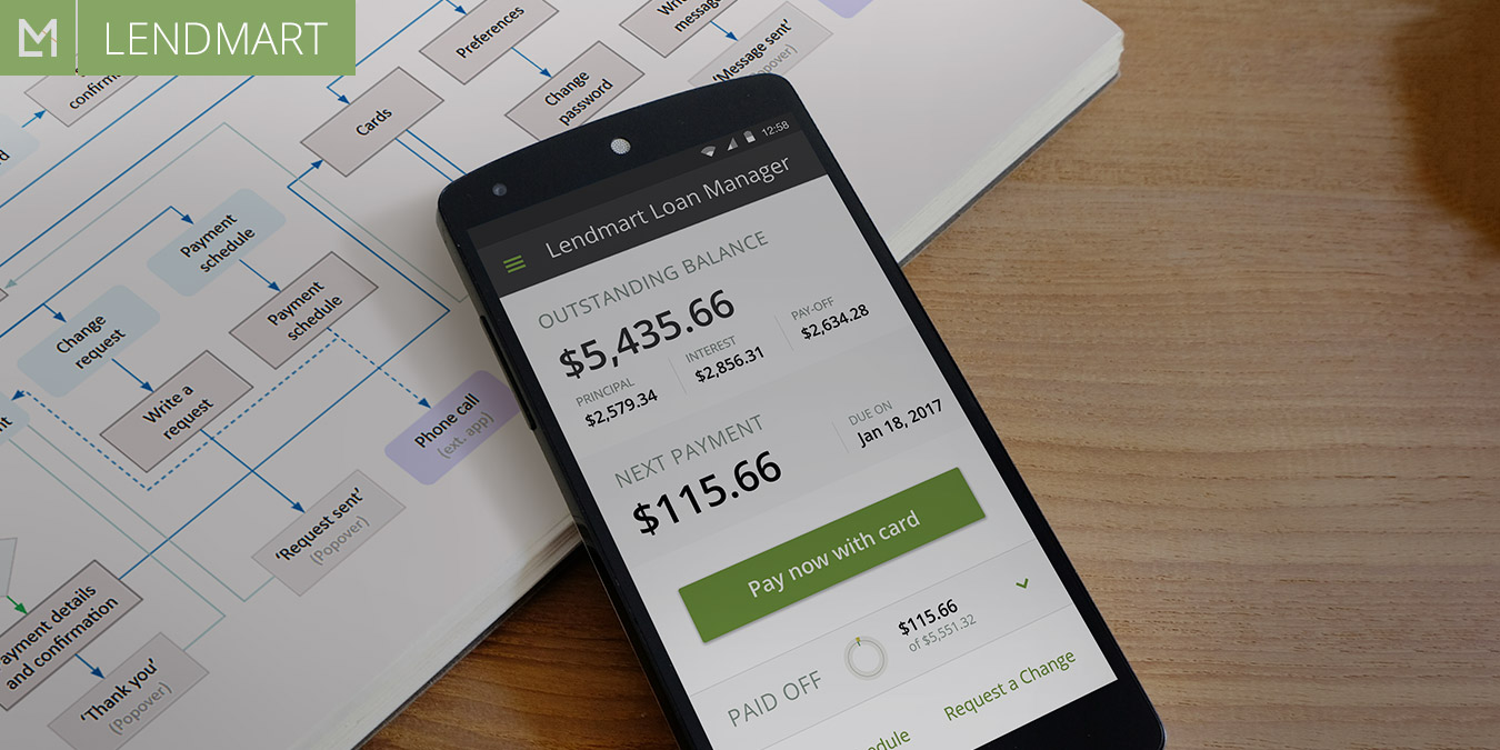
The excerpt
Redesign the application form - improve the way customers apply for loans and increase the form conversion.
- Client:
- Categories:
- Share Project :