Overview
Lottery in the Philippines is carried out by several companies under the supervision of the state regulator and is in great demand. At the same time, with regard to the technologies used, the situation as a whole looks very deplorable. All operations and accounting are still conducted manually, with the help of paper, pens and calculators.
The mission of the partner company, Saturn, was to take the national and local lottery in the Philippines to a new level by introducing modern technologies of operating and accounting. Part of this project was the transition of the ticket sales system to a semi-automated one using POS terminals.

The Challenge
The objective of the project was to develop a lottery serving app for handheld and stationary POS terminals.
The essential attribute was a need to combine the required set of functionality with an extreme simplicity and a very low entry barrier.
Audience
The app was developed to be used by sales agents (ushers) and their managers. The expected number of end-users – from several thousand to several tens of thousands.
The most important characteristic of the audience is their extremely low level of familiarity with technology and low learning ability to any complex processes. Many of them had never used smartphones and the only devices they are familiar with are old-type cellphones.
My Role
I was responsible for the elaboration of user flows and the app UI, and took part in the strategic development of the app’s functionality.
Collaborators
- Saturn and PF3 representatives – collecting info about customers and prototype testing
- Business development manager and CTO – defining the high-level aspects
- Developers – technical implementation
Design Process
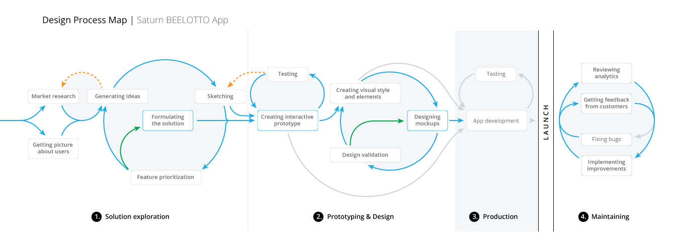
1. Solution exploration
The internal use of the application makes the task easy in terms of attracting and retaining users. On the other hand, the user research in our case showed an extremely low ability of target staff to learn new technologies.
The mental model of most of the currently operating sales agents was limited to interactions with physical objects and the use of paper and pen to work with information. For instance, the usual way of selling tickets was hand writing the guess and the bet amount on the voucher ticket form.
During high-level discussions, we elaborated the main business objectives of the project, among which were:
- Automatic data transmission and processing
- Keeping the sale process speed at a commensurate level
- Ensuring an extremely low entry barrier to minimize current and future training costs
We analyzed the work of sales agents which helped to better understand the specifics of their two main work scenarios:
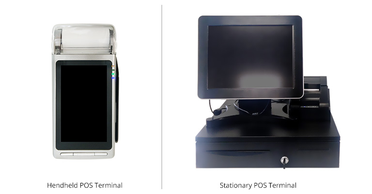
- When using a handheld POS terminal, the sales agent moves freely around the city. The main traits here are the working conditions: variability of external lighting, use of the device “on the go,” noise and external interference, presence or absence of Internet access.
- Sellers working in the branches use stationary terminals. In this case, the human factor (haste and pressure from the clients) becomes the defining component of the conditions.
The required simplicity is achieved based on the following provisions:
- Everything that can be automated should be automated. This includes not only data transfer and processing, but also moving the focus between input fields, scrolling and page transitions, etc.
- Nothing superfluous on the screen – At any moment, a user should only see the information which he’s working with and have access only to the necessary functions.
- Focus on the main action – The user should not have any doubt as to which button to press, the time of decision and action itself should be kept to a minimum.
- Condition-based usability – Adaptation of color contrast, sizes and arrangement of control elements to the operating conditions (external lighting, position of the hand / finger, etc.)
A peculiarity of the project was that the development of the design solution took place in a short time and began before the general business solution was complete. Many functions were requested in the process which contradicted the initial requirement of simplicity.
To determine the necessary and sufficient functionality of the application, we identified four main user scenarios:

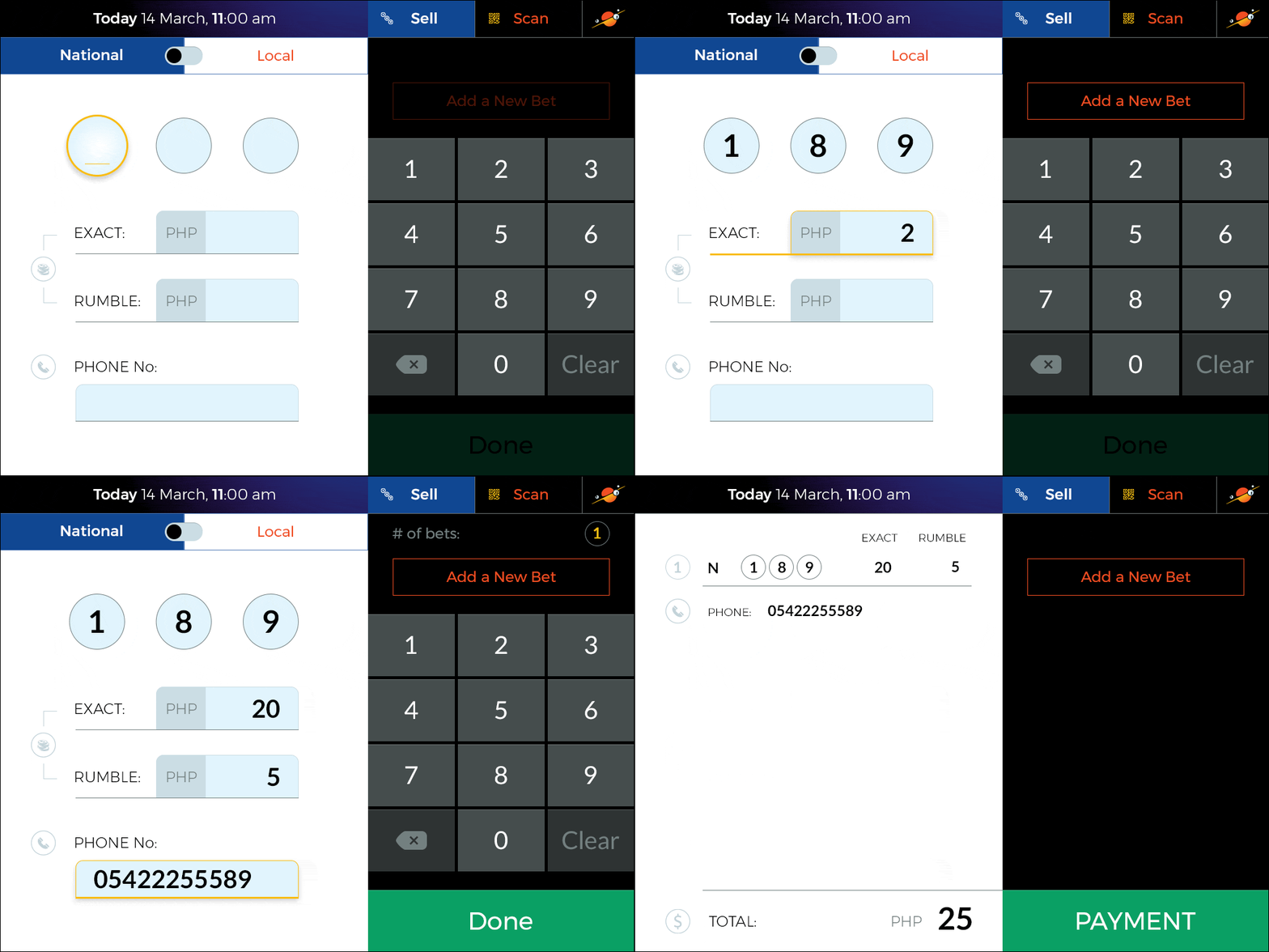
- A client wants to place a bet (buy one or more lottery tickets) – the main scenario, up to 98% of the time the application is used.
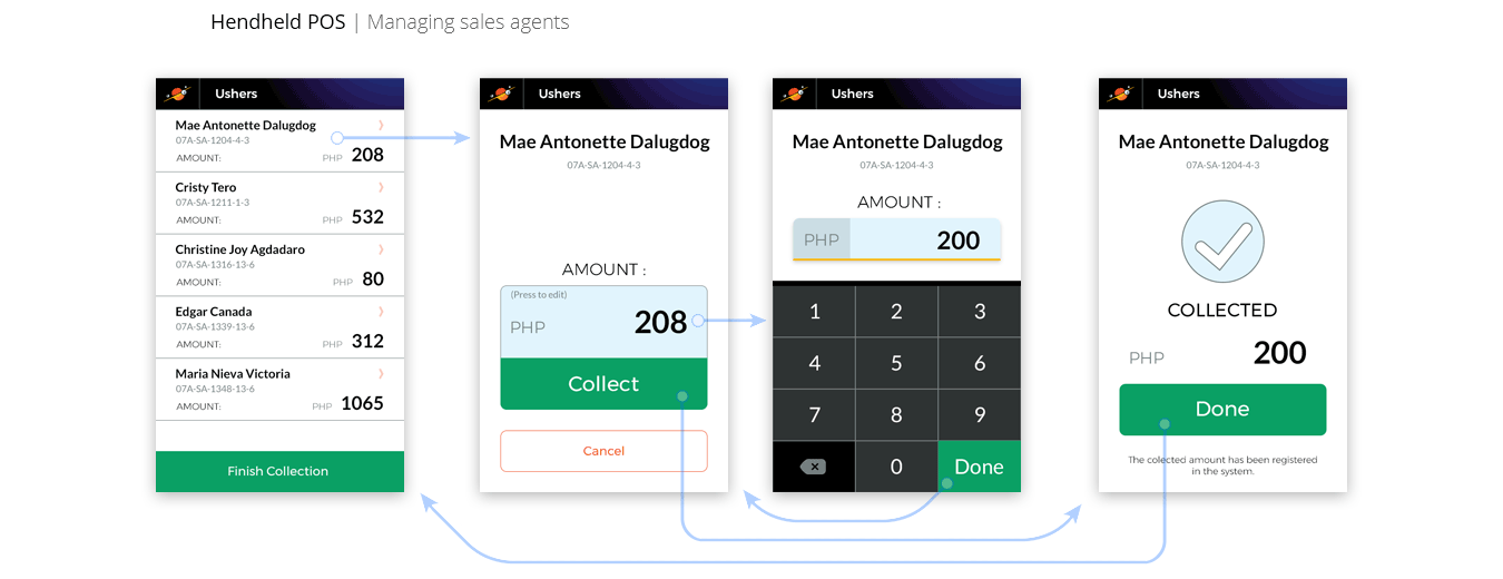
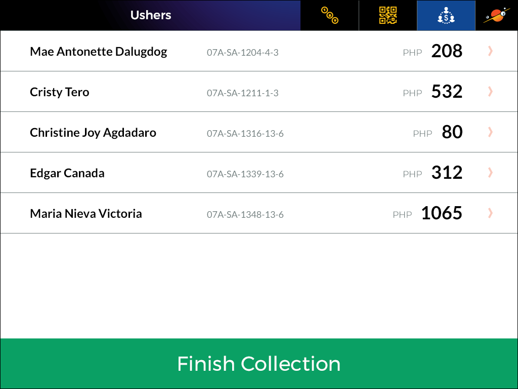
- [Managers only] monitoring agents’ performance and collecting the proceeds.
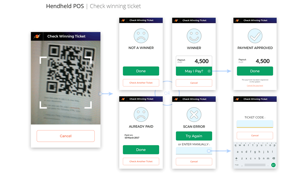
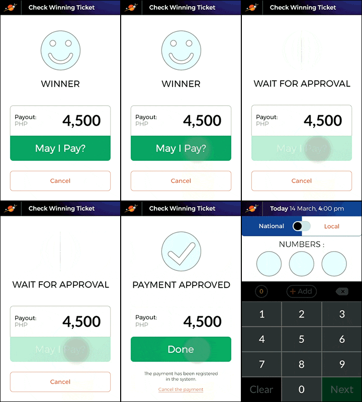
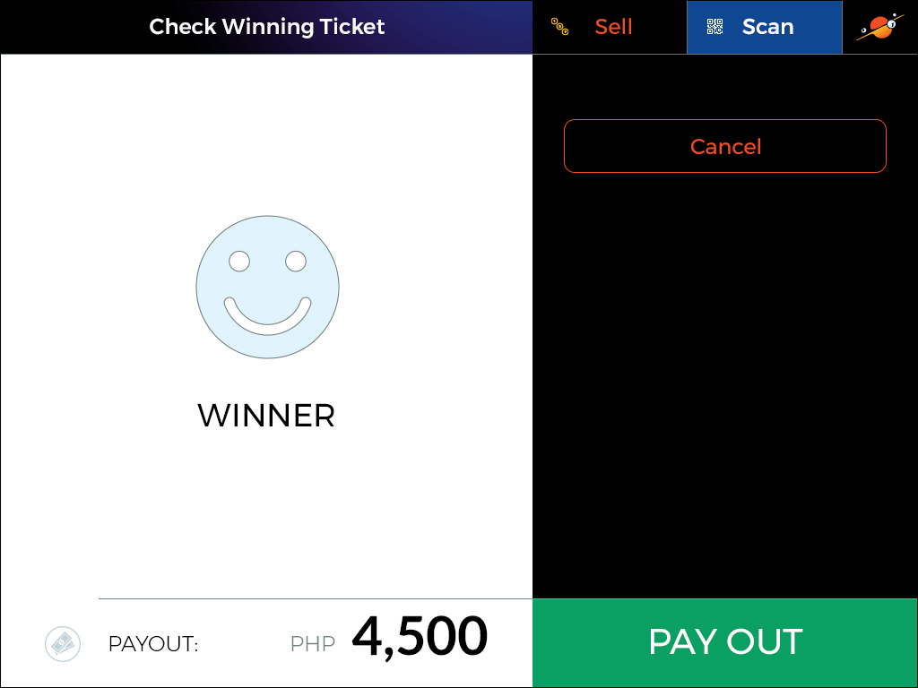
- A client with a winning ticket wants to receive his winnings.
- A user checks his current balance.
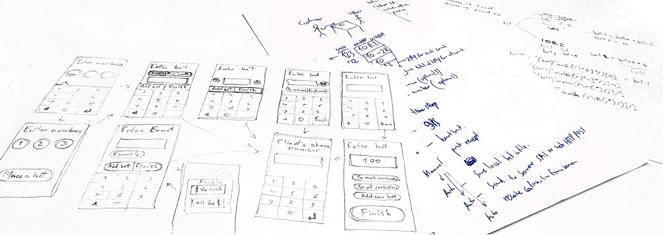
2. Prototyping & Design
Since ease of use and learning was the most important criterion, after preliminary drafts, we decided to start with an interactive prototype for a handheld terminal and testing it on real users.
I developed the initial version of flow and built an interactive prototype in Proto.io laying out most of the principles described above. To narrow the focus, we used a page transition model, which causes only one action on the page.
For the same purpose, I designed a custom keyboard containing only the keys that are useful in the app.
In parallel with this, together with the development team, we made the second prototype, which had all the flow running on one page.
Both options were sent to the Philippines for testing.

The test results showed some advantage of the multi-page version.
However, there was also a surprise. Despite the seeming simplicity, users still had difficulties with an intuitive understanding of the required actions in both versions.
The multipage version caused difficulties in understanding the current place in the flow and forthcoming actions.
In the single-page version, users did not understand what and when to do, and, as we expected, it was also less convenient to use “on the go.”
After analyzing the results, I decided to combine the advantages of both variants, assuming in the process that I’d be able to get rid of their shortcomings.
In the new version, all the flow of information input was located on one page, though only a single functional unit was visible at a moment. Focusing on the action was carried out by scrolling the screen.
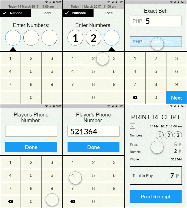
Testing showed that the goal was indeed achieved – the prototype practically did not cause difficulties in understanding and use.
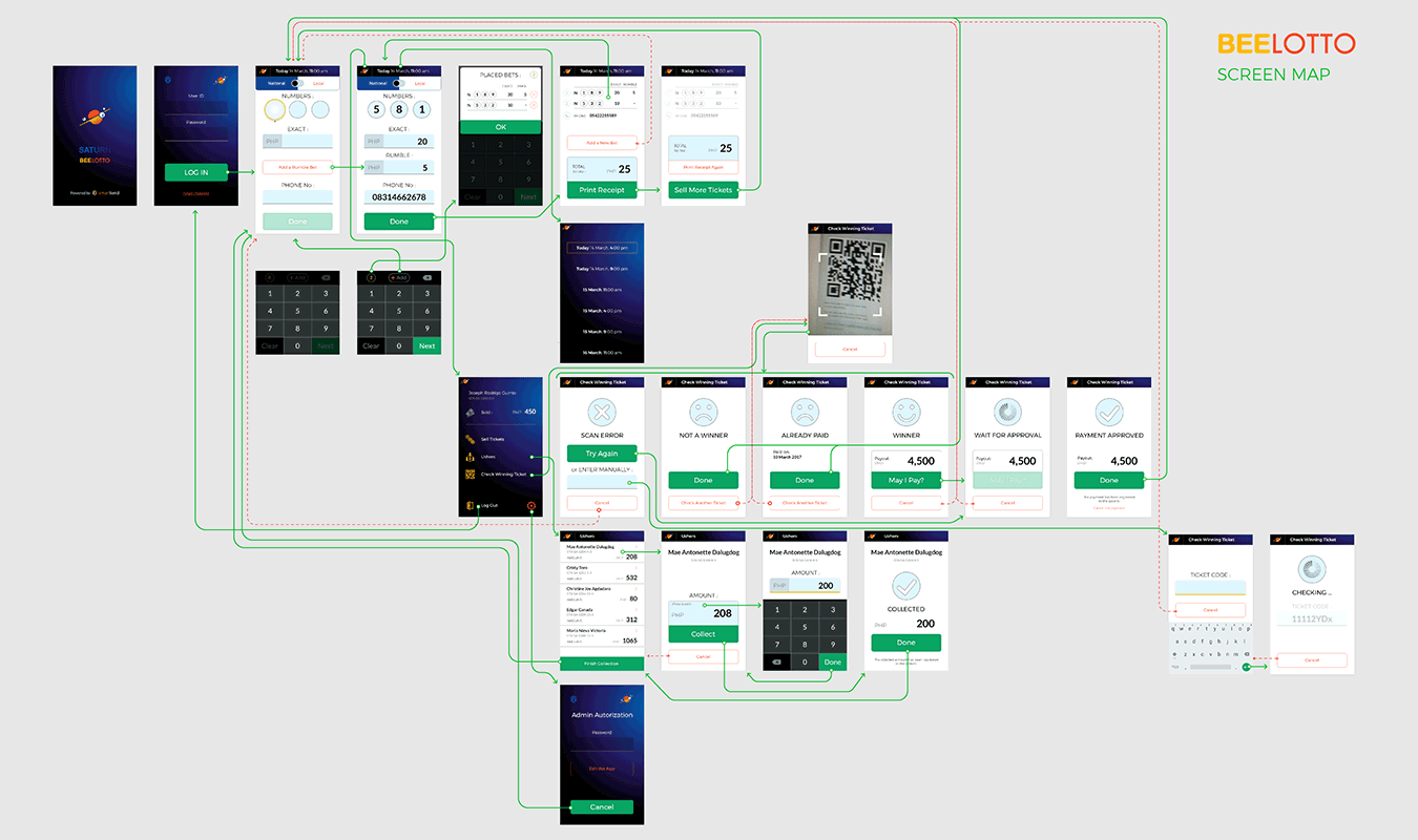
As the app has been developed as a web-app, we weren’t bound by the use of native elements and focused on creating the design most suitable for the case.
An important decision in the design process was the choice of a general visual style. Was it worth using any variation of the skeuomorphic style, as a closer to the mental model of users? Or would it be better to develop the visual within the framework of modern content-first design?
Most of the actions are significantly different from the actions users used to be familiar with from their previous experience. Thus, we came to a decision that imitating the physical world will not lead to a better app understanding in this case.
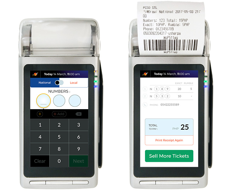
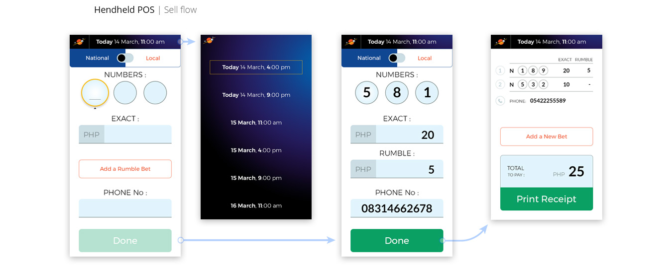

One of the UI issues was choosing the type of navigation.
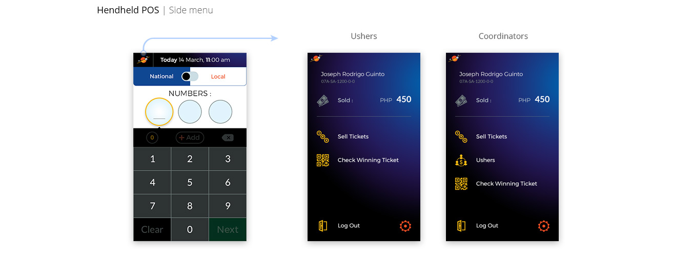
Significant difference in the use cases recurrence (sales use case takes up to 98% of the app usage time), and a limited screen size of the device became the determining factors of choice.
Despite the better usability of the iOS-style tab bar, non-primary functions were moved to the side menu, thus freeing up space and helping to better focus on the actions performed. The “sale” flow was made the home function by default.
Stationary POS Terminal
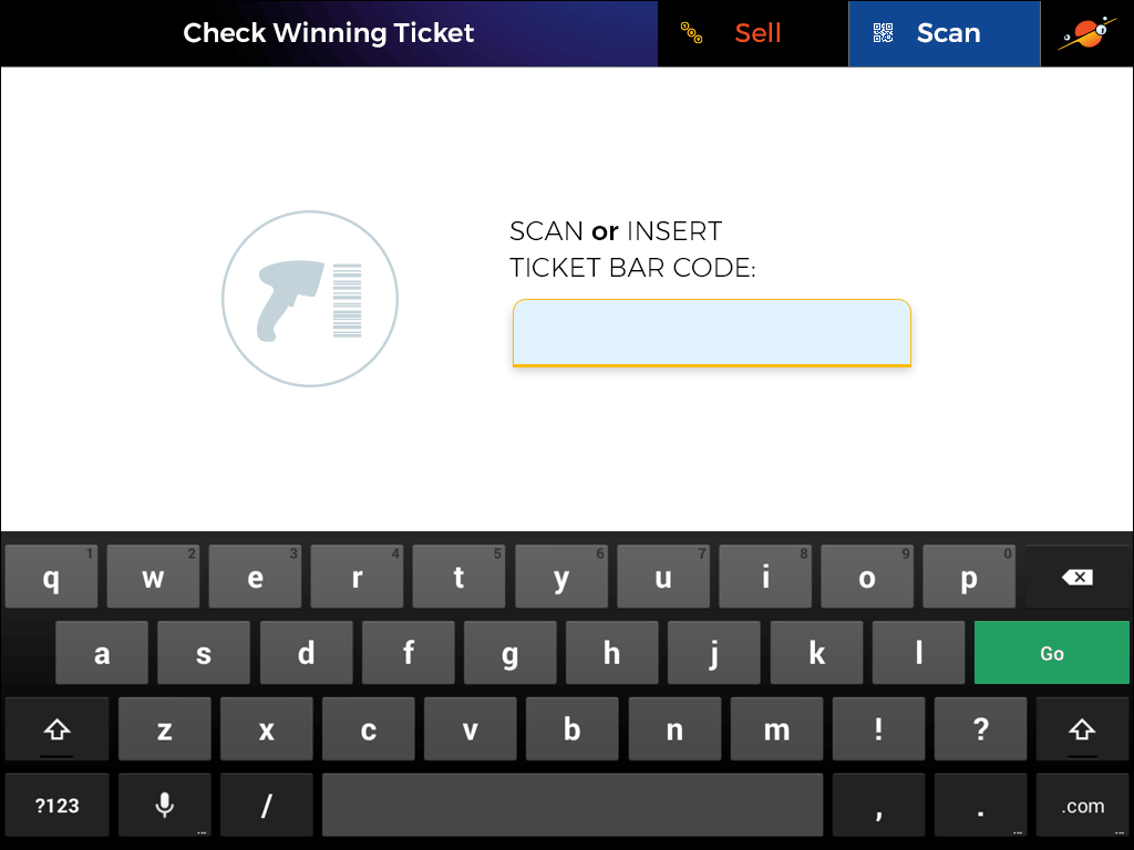
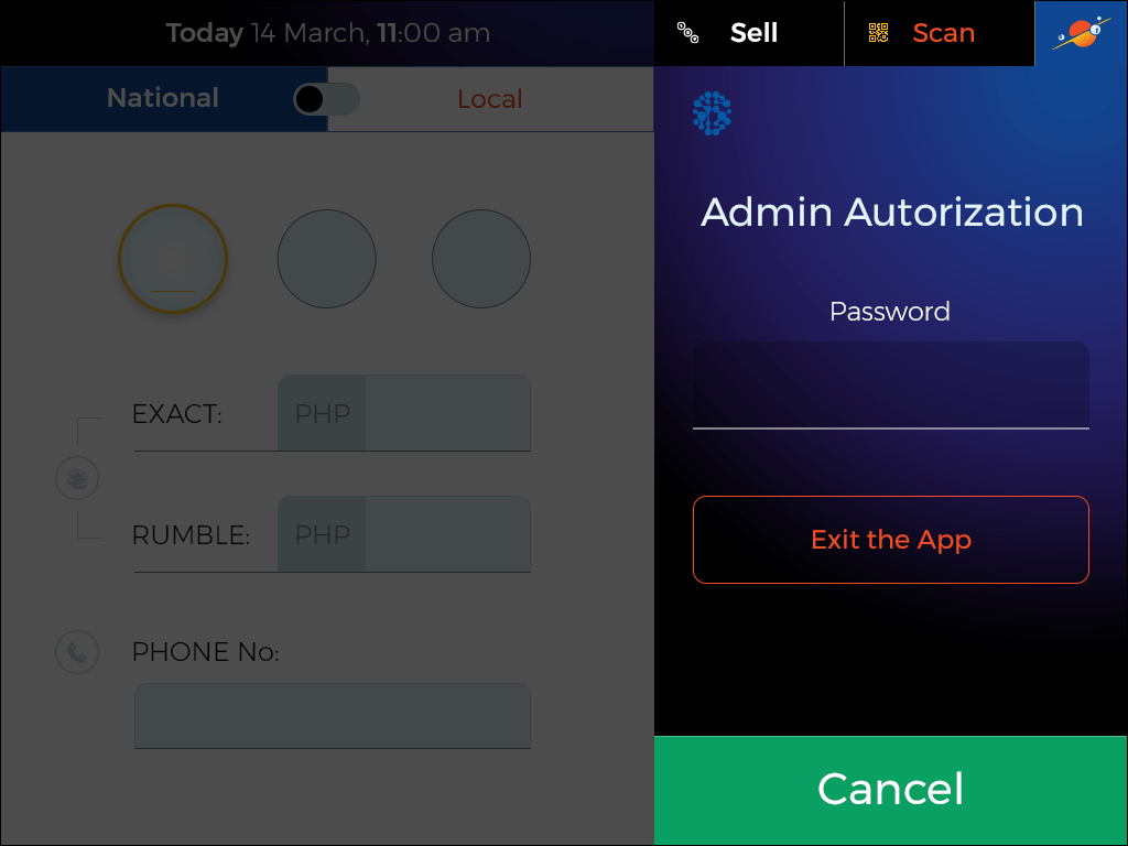
On the stationary terminal, the flows became flatter, with quicker access to additional functions, adopted for the work conditions and extra equipment.
After creating mock-ups in the initial design cycle, I made a prototype for usability testing using the Invision app and tested it on a real device. This caused some design iterations, so the design became best adapted to the terminal dimensions and screen characteristics.
Outcome
The app made a strong impression and was enthusiastically accepted by partner Filipino companies. After preliminary tests, they decided to significantly speed up the sales department transition to the technology developed by us.
For me personally, the project was especially interesting due to the challenge that faced me in terms of the users’ peculiarities.
This was a vivid example of the known UX problem of low level of computer skills among users (see, for example, the article by J.Nelsen). This made it more interesting to find a solution suitable even for their least skilled groups.
An outcome from the experience gained was a development approach, combined user research and analysis at the beginning with some test-driven iterations in continuation. The first part helps to save time on tests and the second provides a reliable high quality result.
The excerpt
Develop a lottery serving app for handheld and stationary POS terminals.
- Client:
- Categories:
- Share Project :

