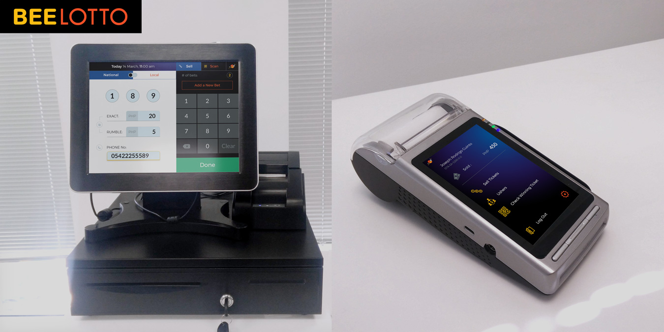
WalkMe Visual Editor
Overview
WalkMe provides its clients with an adoption layer integrated on top of their applications for rapid onboarding and user empowerment.
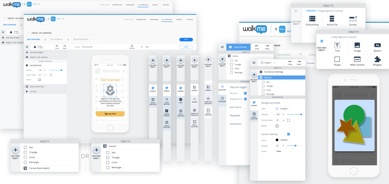
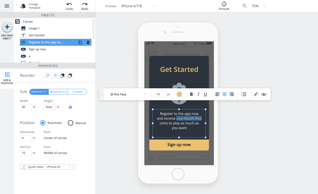
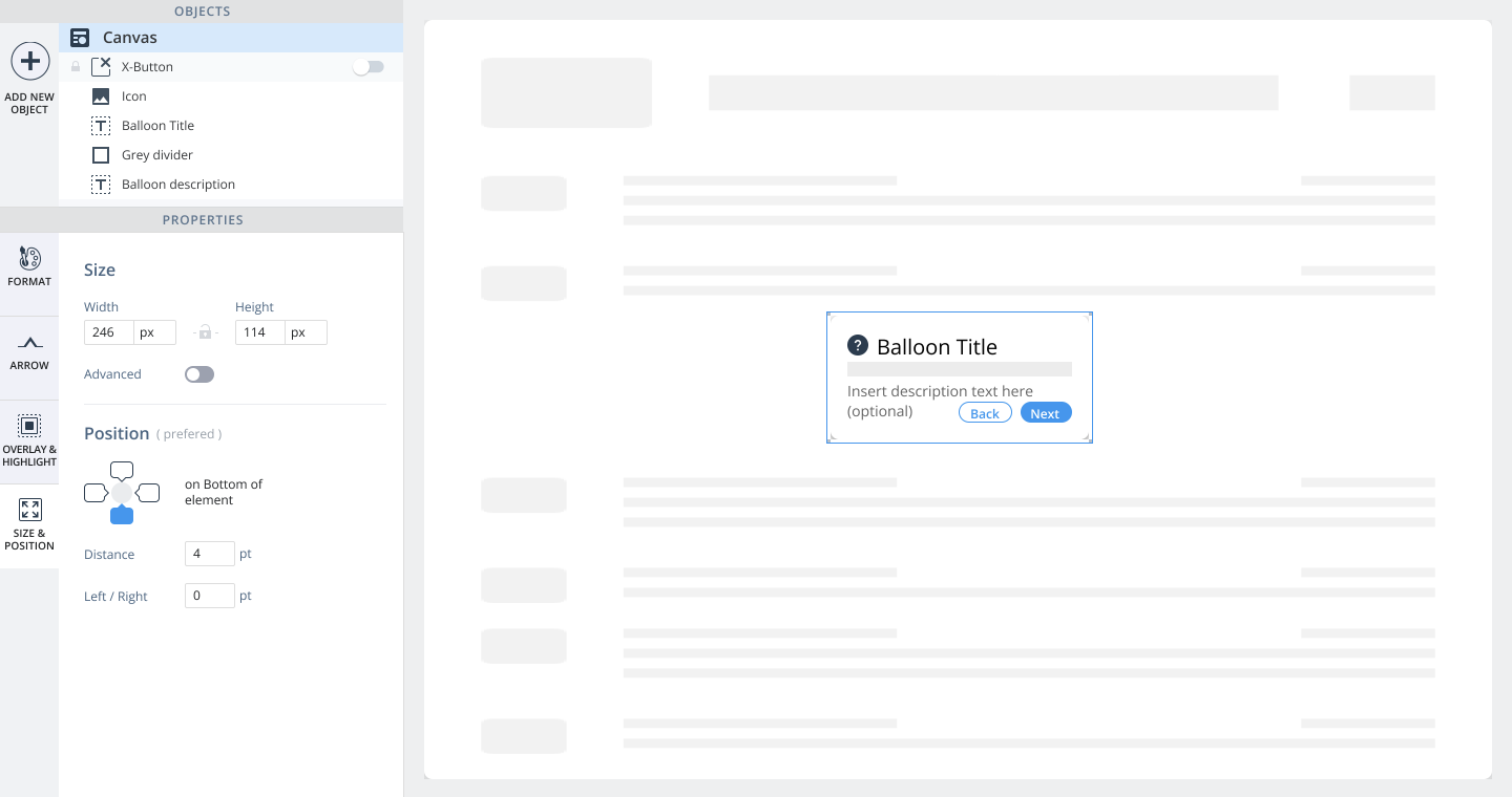
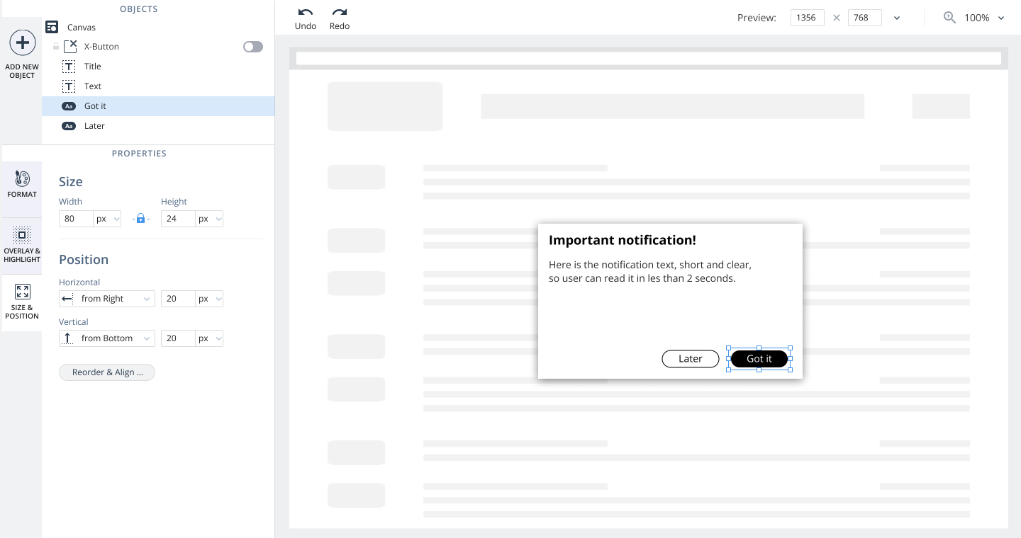
I led the creation of a WYSIWYG (What-You-See-Is-What-You-Get) design tool, enabling customers to easily create engaging shoutouts, surveys, and guidance modules without needing coding skills.
Users
Our primary audience spanned various industries, aiming to boost user adoption on mobile apps. Users ranged from basic to advanced technical and design skills, necessitating a versatile and intuitive design platform.
Main Challenge
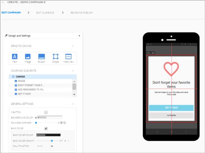
The old editor had very limited capabilities of designiing artifacts. We needed to create a user-friendly tool that offered flexibility and rich functionality, accommodating users with varying levels of familiarity with such tools.
The old WYSIWYG
My Role
As Principal Designer of the project, I managed the entire design process from concept to implementation. I focused on understanding user needs and creating an intuitive interface and seamless interaction patterns, ensuring a smooth user experience and strategic feature development.
Collaboration
I worked closely with the Mobile Product Manager and the Mobile R&D team, including developers and QA. Our teamwork enabled iterative design and usability testing, turning our vision into reality and refining the product continuously.
Design Process

01
Research
We began with a thorough analysis, collecting customer feedback, performing heuristic evaluations, and conducting competitor research. We also defined target personas through user research.
02
Problem Statement
We clarified user objectives, challenges with the old editor, and opportunities to improve.
03
Ideation
Brainstorming with the PM and UX director helped us develop solutions to identified problems.
04
Concept Solution
We created and iterated on concept designs, validating them with the technical team.
05
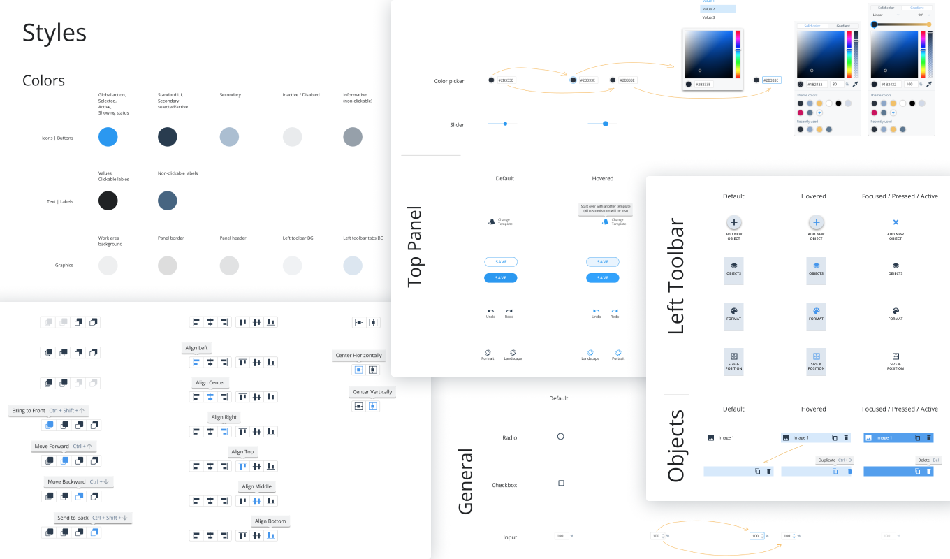
UI Elements and Style
Defining UI elements and the visual style ensured functionality, brand alignment, and design scalability.
06
Feature Design, UX/UI
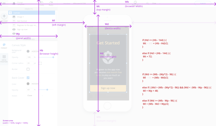
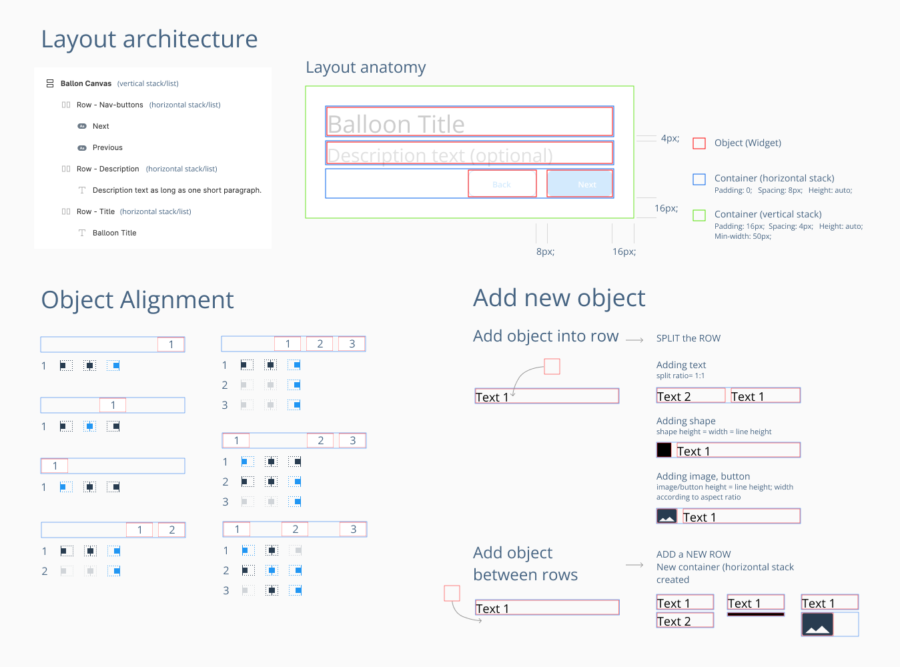
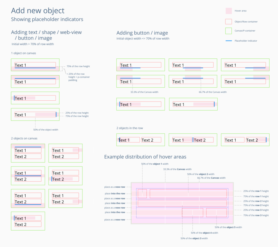
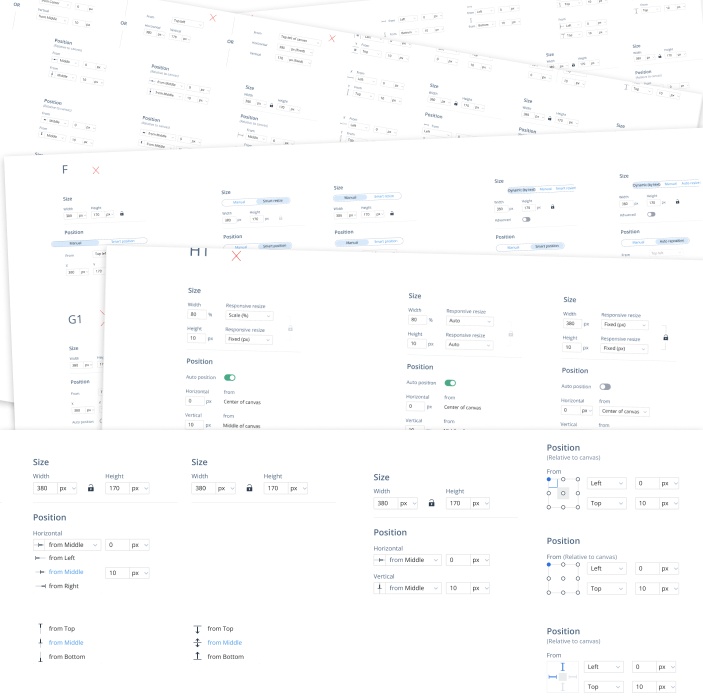
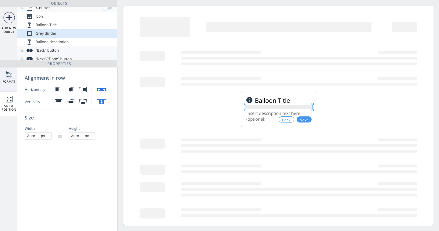
Divided into logical and architectural blocks (features), the WYSIWYG editor underwent numerous design cycles, from information architecture to detailed parameter controls, maximizing usability and functionality.
07
Usability Testing
Each design went through rigorous usability testing. Feedback guided iterative refinements to eliminate pain points and enhance user satisfaction.
08
Feature Development and Design QA
Approved designs moved into development, with continuous collaboration and QA to ensure the final product met the design vision. We balanced powerful design tool functionality with simplicity for less design-savvy users.
Outcome
This project empowered users to create engaging content without coding and positioned WalkMe as a leader in no-code editing capabilities among all DAP tools. Despite being developed several years ago, its WYSIWYG Design tool remains unmatched in flexibility and functionality, surpassing competitors.
It was particularly challenging in terms of designing within technical constraints and for diverse user types. It reinforced that even well-proven solutions might not always be the best, highlighting the importance of iterative design, user testing, and interdisciplinary collaboration – something I carry forward in my career.
